COLOURMATE DIGITAl

Colour Guide For Printing And Branding"
"ColourMate Digital-
“A practical guide to colour psychology, consistency, and best practices for digital printing.”
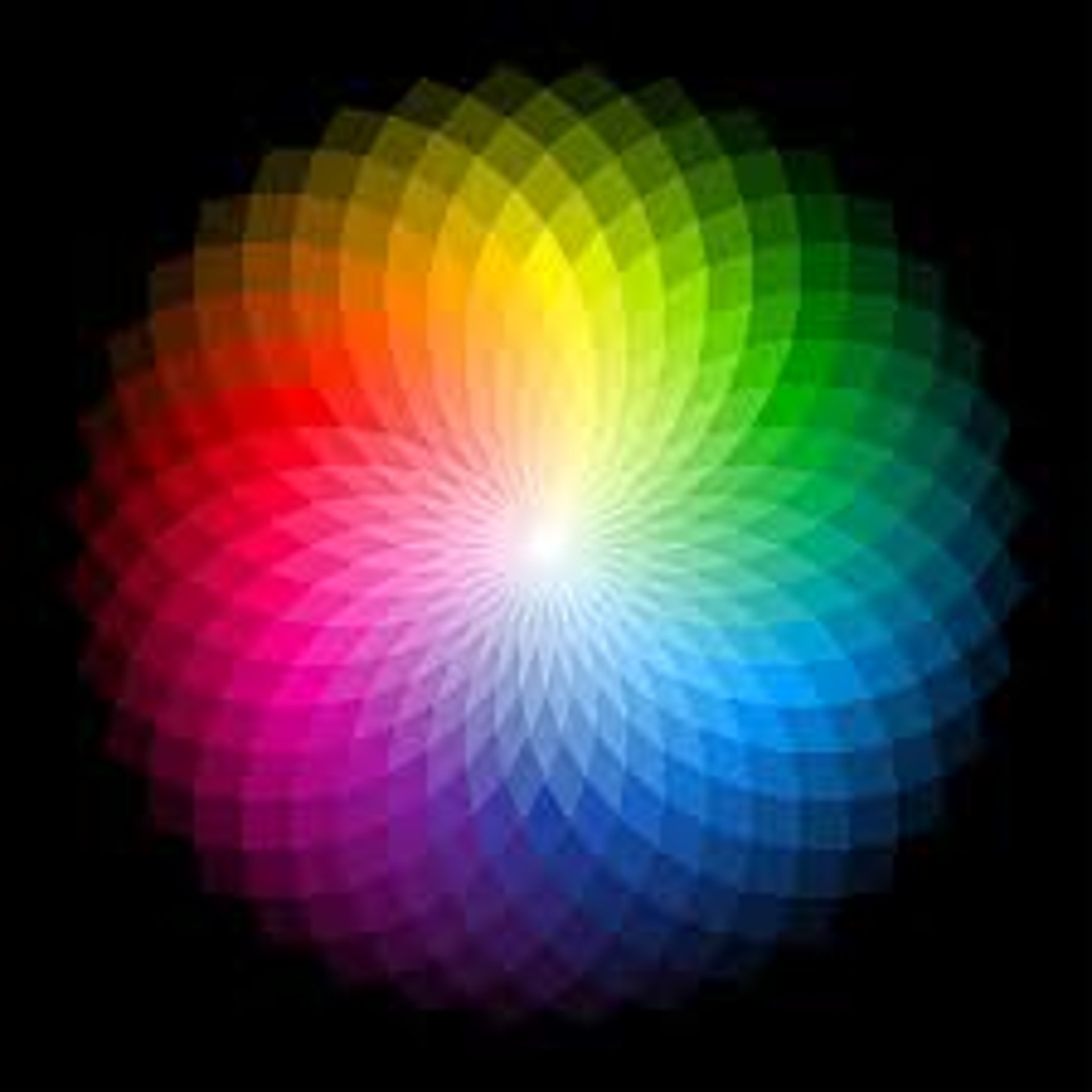
Why Colour Matters
Colour isn’t just visual – it communicates your brand’s personality, creates emotional impact, and ensures consistency across all mediums. The right colours make your brand memorable.
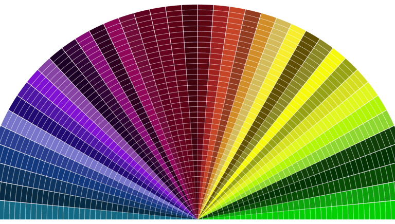
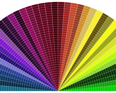


Understanding Colour Systems
RGB (Red, Green, Blue): For screens and digital displays. Not suitable for print.
CMYK (Cyan, Magenta, Yellow, Black): Standard for printing. Ensures accurate reproduction.
Pantone (PMS): A universal colour matching system. Guarantees colour consistency across printers and materials.
Colour Psychology in Branding
🔴 Red: Energy, passion, urgency
🔵 Blue: Trust, stability, professionalism
🟢 Green: Growth, freshness, eco-friendly
🟡 Yellow: Optimism, creativity, attention
⚫ Black: Luxury, authority, elegance
⚪ White: Simplicity, purity, modernity
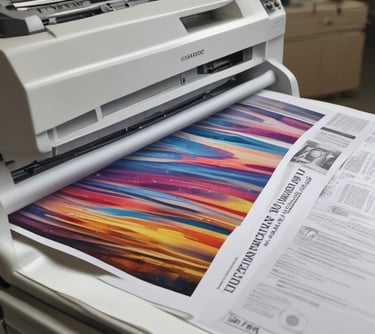
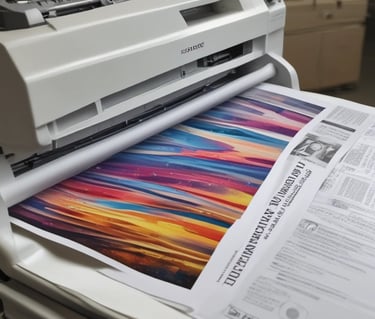
Best Practices for Colour In Printing
✔ Convert all files to CMYK before printing
✔ Use Pantone references for brand colours
✔ Test colours on sample material before bulk printing
✔ Ensure colours remain consistent across substrates (vinyl, fabric, paper, board, acrylic, etc.)
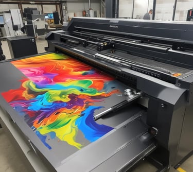
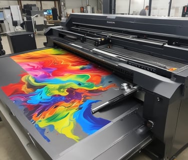
Colourmate Expertise
High-precision digital printing with consistent colours
Colour calibration for accurate reproduction
Matching brand guidelines across large formats
Creating vibrant displays that stand out
At Colourmate Digital, we specialise in:
Quick Colour Checklist
✅ Files in CMYK or Pantone
✅ Contrast checked for readability
✅ Colours tested on final material
✅ Brand palette consistency maintained
✨ With the right colours, your brand speaks louder than words. Trust Colourmate to bring your colours to life.


COLOURMATE DIGITAL
Innovative printing solutions for all your needs.
© 2025 COLOURMATE DIGITAL PVT LTD. All rights reserved.
“Leading with Precision, Power, and Possibilities"